Last week we discussed the idea that the Apple Watch, due to hit the market in the Spring, was considered by some to be more a triumph of style over function. Apple itself fed into this notion when senior executives insisted on calling the device “jewelry,” and when they openly look for new sales staff who have fashion retail experience.
There’s no doubt that Apple sees the Apple Watch’s styling as a competitive advantage over other smartwatches on the market. Furthermore, it is undoubtedly true that certain Apple Watch features, such as the Digital Crown and Force Touch, set the device apart from the rest of the crowd.
On the other hand, it could also be argued that the inner workings of the Apple Watch, the things we never see, are what constitutes the device’s greatest strength.
Systems Integration and Connectivity
It is exceedingly difficult, if not impossible, to develop a standalone smartwatch that doesn’t turn into a big clunky device on your wrist. You cannot combine enough battery power and computing power into a standalone smartwatch without it becoming big and unwieldy.
So, smartwatch makers wisely agree that the solution lies in having the device integrate with a smartphone. The smartphone acts as a remote server and the watch acts as the user interface. But the reality is that Apple has long been an industry leader in the integration of the hardware and software of individual devices. iMacs have been talking seamlessly to iPhones for many years now. Connectivity is an Apple specialty.
On the other hand, Google’s Android is, by comparison, a dog’s breakfast of hardware and software with no long-term history of system integration and compatibility. Industry analyst Mark Hibben argues in Seeking Alpha that Samsung’s Android Wear or even Microsoft’s Band “will inevitably fail to achieve the integration necessary for a truly satisfying experience. The pastiche of hardware and software that is Android will founder on the rocks of systems integration.”
Apple’s advantages in connectivity are built right into its operating system. Apple’s developer environment, Xcode, does most of the integration work in conjunction with iOS. Developers don’t need to bother with creating communications links at all. Unlike the painstaking communication work that needs to be taken in the development of apps for Android, Apple Watch developers only need to focus on building reformatted iPhone apps.
Hibben goes on to say that “by making it so easy for iPhone developers to build Apple Watch apps, Apple has assured it will have a large vibrant app ecosystem for Apple Watch virtually overnight. As we have seen with mobile devices, the health of the app ecosystem is often critical for the success of the device. Here, Apple will quickly outpace its nearest rival, Android, while leaping far ahead of any other competitors.”
How Instagram Might Look on the Apple Watch
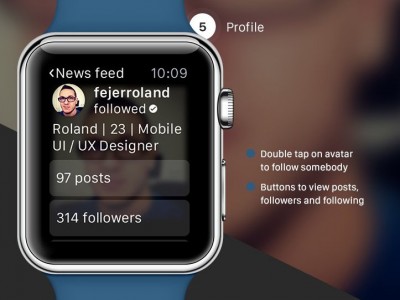
Since we won’t actually be holding a real live Apple Watch in our hands until next spring, a cottage industry has sprung up in which would-be developers mock-up how certain apps will look on the Apple Watch as a kind of speculative preview. The Hungary-based design firm JBS Labs has come up with a really nice anticipation of how Instagram might end up looking on the Apple Watch.
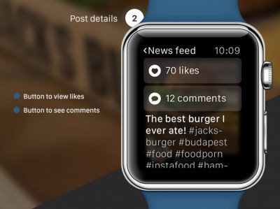
In their view, photos are displayed at the maximum width possible in the newsfeed, and in order to keep the screen tidy, the only other information you see is the poster’s name and avatar. To like a post, you could still double tap the photo, but tapping only once would bring up the details traditionally found underneath an Instagram post.
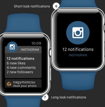
Then, after seeing the post’s details, you could then get access to the list of comments and people who liked the post. JBS also showed how Instagram could take advantage of the Apple Watch’s two styles of notifications, “short look” and “long look”.
Pretty nice job, and we look forward to other mock-ups of Apple functions, because those plus our imaginations are all we got until the damn thing is released next Spring.

