How nice to have some Apple Watch features revealed officially, as opposed to having them “leaked” by “someone on the supply chain”. Leaks tend to turn out to be right only about half the time, leading to a lot of misleading or mistaken impressions. But this source is legit.
Apple has released its “WatchKit” software development kit for developers, so we know the details revealed within it are for real. The iOS 8.2 SDK beta is available for immediate download by iOS Developer Program members, and it discusses several Apple Watch features that were not detailed before.
For example, we finally get the pixel densities for both sizes of the Apple Watch. The 38mm screen will have a pixel density of 340 x 272 px, while the 42mm version will display at 390 x 312 px.
The Apple Watch Features Three Types of Screens
 It is pretty exciting to discover that one of the Apple Watch features will be three types of screens: Glance, Actionable Notifications, and the app screen.
The Glance screen is a short blurb of information that comes from an app, but that is “timely and contextually relevant”, according to the WatchKit. Presumably this means that it will be based on situational input like location or time. But it’s important to note that Apple says the content on the Glance screen will be determined by the wearer: “Unlike an alert pushed to a device, Glances are accessed at the wearer’s discretion”.
We’re not sure if this means the device will have to be “trained” or “programmed” to perform this way, but it’s a nice development just the same.
Actionable Notifications will allow the wearer to respond, go into the app, and perform other actions. This is a common smartwatch function, but the significance is that it is separated from the Glance function, which I guess follows the old maxim that there’s a time to think, and a time to act.
Does the Apple Watch Feature Intense Interaction or Not?
 The WatchKit guidelines contain a lot of discussion about how Apple is hoping that wearers interact with the device. The document makes pretty clear that the company doesn’t expect people to be staring at the watchface all day long. It states that “a Watch app complements your iOS app; it does not replace it. If you measure interactions with your iOS app in minutes, you can expect interactions with your Apple Watch to be measured in seconds.”
Clearly, Apple doesn’t want people to be watching videos or writing emails on this device, which was actually one of the concerns of some people early on in the process.
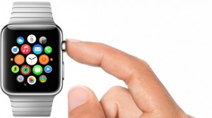
On the other hand, the WatchKit sheds a little more light on the Digital Crown, the side-positioned wheel that was originally presented as a way to zoom in and out of the home screen. The document says that “designed for finely tuned, accelerated scrolling—without obstructing the Apple Watch display—the Digital Crown makes it easy to scroll through longer pages.”
So, lets get this straight: Apple doesn’t want us to be looking at the Apple watch for very long, and yet they’ve accommodated reading longer pages of text. Contradictory, or just another example of Apple wanting it all?
The Apple Watch Features Unique Fonts and Force Touch
 In addition, here’s one of the Apple Watch features that we didn’t hear much about before: the typeface. Called “San Francisco”, the typeface was designed specifically for the Apple Watch. But the WatchKit info sheds a little more light on why it is suited for the small screen.
Unlike some fonts, San Francisco will condense or expand based on the size of the letters. If you’re reading tiny text, for example, the kerning will expand so there’s more space between each letter—as will the size of the punctuation and the size of the holes in letters like “e” and “a”. This will make it much less difficult to read the watch’s tiny text. Brilliant.
We also get a little more info about the Force Touch feature, which will interpret the force of your finger. “A small screen can only accommodate so many controls,” Apple states. “Force Touch interactions display the context menu (if any) associated with the current screen. Apps use this menu to display actions relevant to the current content.” Force Touch will act like a secondary layer of interactions. You use it to access a higher level menu that displays options within each app.
Pretty sophisticated stuff. Finally, some legitimate info about the Apple Watch features has got me all excited again about this darn thing.
